Life in Christian County, Kentucky... And What I Think About It...

We've banked with Heritage Bank (formerly Hopkinsville Federal Savings Bank) since we came to Hopkinsville. The bank seems to be doing well. After changing its name and going public with its stock, it has built two large new facilities.
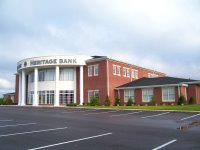
I thought the massive two-story Heritage Bank on Fort Campbell Blvd. would be the main office for the next century, but they've recently built an even larger building (above) on Eagle Way Bypass. I drive by it every day enroute to Isaac's school, so the location is convenient for me, at least until Isaac graduates.
Keely and I stopped there on Tuesday morning. It was the second time I'd been in the building, and the first time for Keely.
As we walked across the parking lot to the front door, Keely commented that the building is intimidating. She looks at the formal facade and massive pillars with the eyes of a financially insecure college student. She's a little worried about money most of the time, and the bank doesn't look friendly to her. (Listen up, ye architects.)
We pulled open the slightly stubborn front doors (also not very welcoming) and went inside. The lobby is deep and the teller area is at the very back. We passed a greeter at a desk and a showcase area where two large motorcycles are parked.
At the back, a couple of curved counters serve the dual purpose of providing a writing surface and encouraging customers to get in line. The room felt more and more like a cave as we left natural light behind.
Keely and I decided that the ceiling is too low in the lobby. Given the scale of the building, the depth of the room, and the large items on display, the 8-foot (9 foot? 10 foot? whatever it is!) ceiling is not enough. The lobby would feel more open and the feng shui (flow of light, air, energy, and in this case, possibly money as well) would be much better if the ceiling were higher.
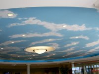
The ceiling has been faux-painted as a sky and the flooring is beige ceramic tiles. I wonder if the decorator hoped to visually raise the ceiling with the cloud scene, or perhaps put people in the mood for vacation with the sky-and-sand color scheme.
Faux painting is sometimes fun and witty, but I don't like this ceiling in this building. It seems silly and a bit schizo after the imposing formality of the building's exterior -- a real anti-climax.
The low ceilings in the lobby do made it possible to have a full second floor with nice views from some offices that most customers will never see.
Will we withdraw our money and take it to another bank because Keely and I don't like the new building? No, but our family was a building fund contributor through 15 years of mortgaged servitude (free at last!) so we're certainly entitled to our opinion.

Technorati tags:
No comments:
Post a Comment